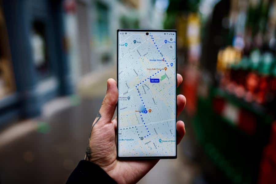
Soon, Google Maps could show you COVID-19 data in states, counties, and cities. With the update, you’ll see a COVID toggle in your app. Tick that to see a seven-day average of COVID-19 cases in areas per 10,000 people.
You’ll know the case rates in an area through its color. Moreover, a label should tell you whether cases in the area are rising or dropping. Check your Maps apps on Android or iOS this week.
Google Maps and COVID-19 Data
In a blog post, Google said that the new COVID layer should help people “make more informed decisions” about traveling under the pandemic. Experts and the CDC also recommend for people to check COVID-19 numbers in their area. With tracking, people would know the risk of doing some activities.
Google Maps adds an overlay of COVID-19 case trends https://t.co/D7HKxY3pM6 pic.twitter.com/XwNNKjwgp6
— The Verge (@verge) September 24, 2020
Parents also have to consider COVID numbers when deciding to send their kids back to school. With the holidays coming around, families must know if going home should be safe.
Where Does Google Maps Pull Its Data?
The Verge reports that Google Maps pulls its COVID data from Johns Hopkins University’s COVID-19 tracker, Wikipedia, and The New York Times.
Is Google Maps Releasing Other COVID Tools?
Google Maps has rolled out other COVID-19 tools over the past months. For example, the app now tells you about mask mandates in public transportation. You’ll also get information on restaurant takeouts. Finally, you’ll even get warnings to go to your doctor if you suspect COVID-19 infection.
COVID-19 numbers in the US are rising again, mainly from outbreaks in the Midwest. Experts now warn of a surge of cases in the fall.


